Summary Analytics
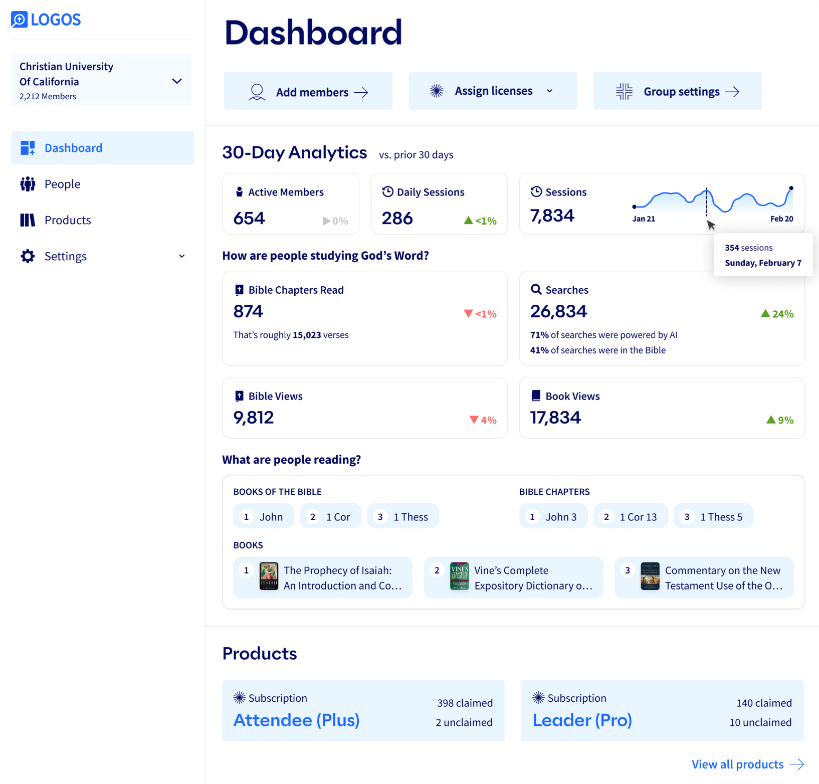
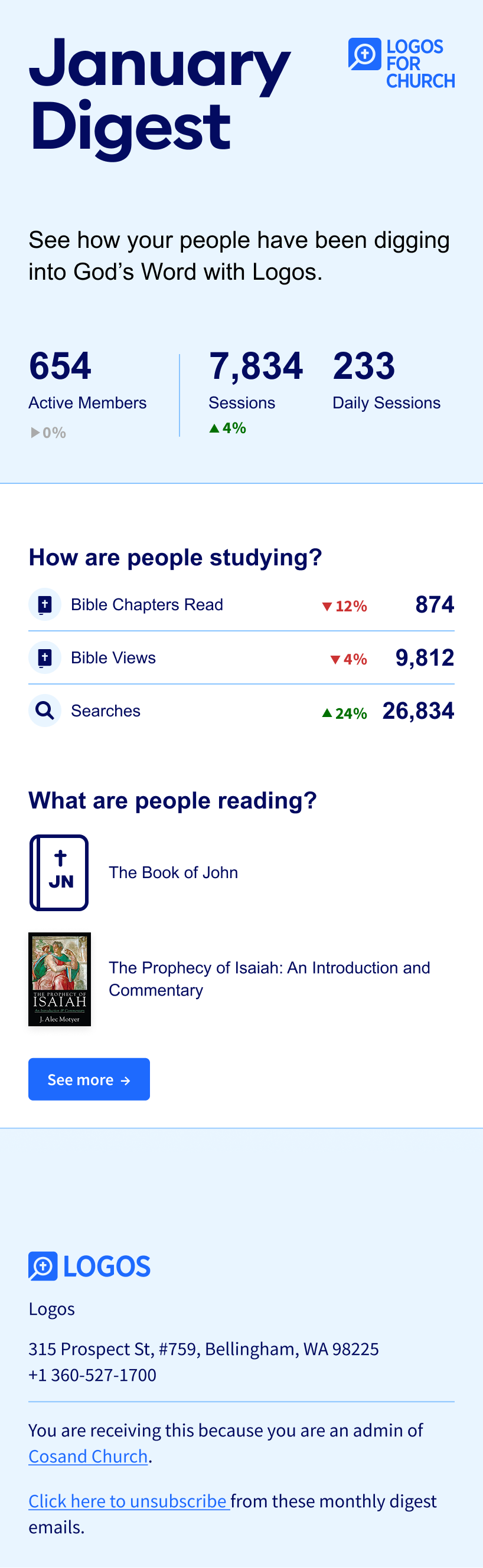
A summarized analytics dashboard and digest email to help institutional customers track end-user adoption of the Logos platform and affirm their investment.
- Figma
- FigJam
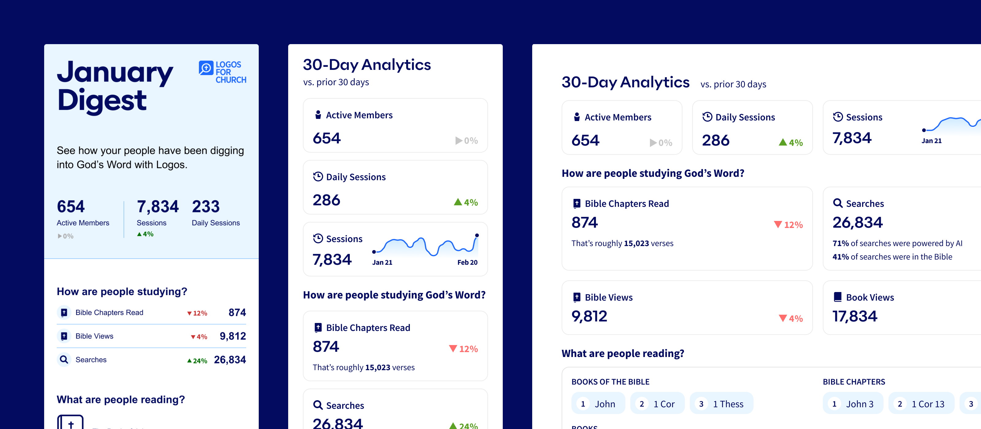
The Problem
We’d recently launched Logos for Church and Education as B2B SaaS products and were seeing relatively high churn. One way we thought to address it was to let customers know that their members are in fact getting value out of their investment.
They had no way to measure product adoption.
We had a long-term strategy document that proposed a robust analytics platform for administrators, but it was broad in scope, mired in technical detail, and so hadn’t made it onto the roadmap.
The First Step
The first step was for me to write a new project brief, one that was tight in scope and purpose. Churn was the problem to address, and we didn’t need a full analytics suite to solve it.
But who specifically were we optimizing for, what questions did they need answered, what data could we collect that would answer those questions, and where would it all go?
Who were we optimizing for?
While our enterprise product is intended for Christian schools and churches, it was churches that were churning. I narrowed our focus to the feedback we were getting from church customers.
What questions did the data need to answer?
Customer interviews surfaced a few specific questions that would anchor the work moving forward: “Are my people using Logos?” “Are they reading?” and, “Are we trending in the right direction?”
What data could we show?
This was a surprisingly difficult question to answer. We had multiple data logging and storage technologies and it was tradeoffs all the way down. My role was to advocate for the outcomes we wanted, and push development to spec the plumbing that would get us there.
Where would it all go?
The Admin Portal web app was the natural place, but admin users had thus far only used the portal for configuring their implementation, so reaching out to them via email would be critical for education.
Wireframing
We already had existing design patterns for pseudo-KPI cards on the Dashboard, but we had no such patterns for email.
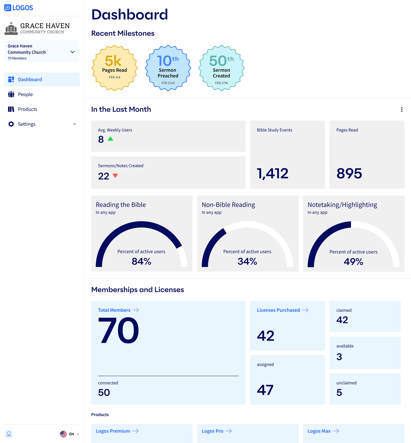
The initial wireframes for the portal proved the existing components weren’t suited to the amount of data I wanted to display. I went back and started drawing new components from scratch.
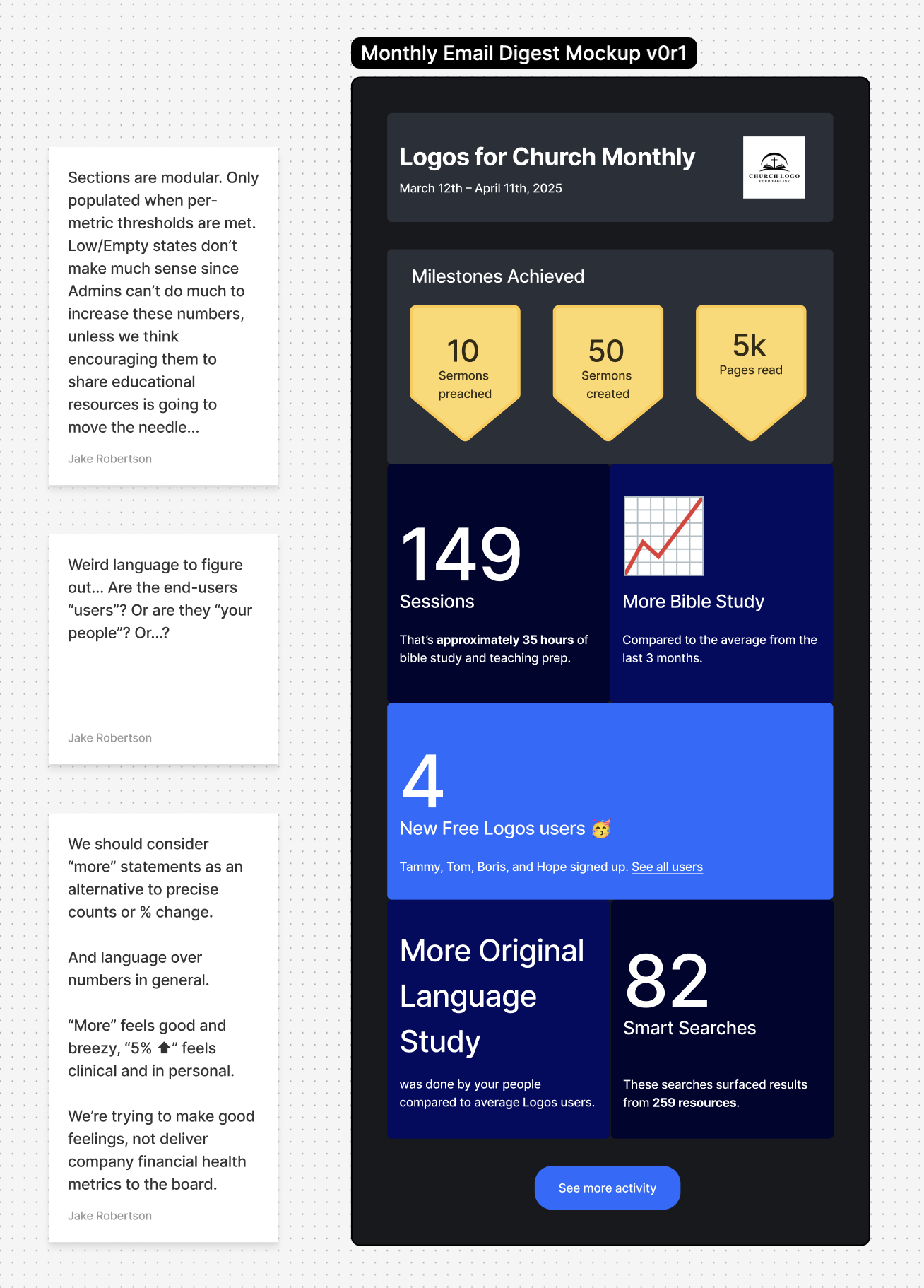
The initial wireframes for the email were deliberately low fidelity as I wanted to focus discussion on the variables that made the email a unique surface: precisely what subset of the Dashboard data was appropriate to include, in what layout, at what cadence, and to what audience.
Tricky Bits
It became clear that both surfaces would need to:
- protect end-user privacy when the reported data had insufficient volume to anonymize effectively
- withhold visualizing some data until there was sufficient data to be impactful
- have a clear and intuitive rule that governs what users are included in the dataset
The last one was particularly thorny because universities and churches want to communicate with a large number of people, and they offer our products to a subset of those people, our premium SaaS product a subset of those (often seasonally), and of those, only some will claim the product licenses they’re entitled to. While the Analytics page may be concerned only with Logos end-users, the Admin Portal as a whole supports use cases for Institution Members who did not have accounts with us and/or licenses to our products.
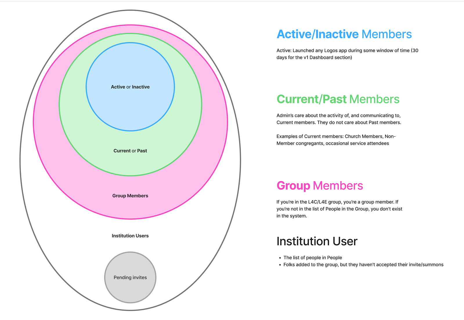
I advocated for an architecture that served the Analytics user experience by trimming the dataset to only the most relevant types of members, while also supporting the Admin Portal user stories outside of analytics. Implementing this solution also helped clarify preexisting muddiness in the product claiming and sign-up flows.
The Final Solutions
Outcome
This feature has only been live for less than a month, so the only evidence we have of its impact is the relatively high open rate on the first digest email and the resulting jump in traffic to the Dashboard.
I’ll be looking for:
- A correlation between engagement with both the email/dashboard and churn rate.
- AI-analyzed sentiment about this feature’s utility from customer service and sales calls
As you’ll see in the Analytics Page case study, this work was a solid foundation that would soon be extended into robust Analytics tooling our academic customers needed.