You Need A Sankey
A privacy-first web app that turns a YNAB budget export into an interactive Sankey diagram
- AI Prototyping
My Problem
Once a year my spouse and I review the prior year’s spending and decide how we want to spend in the coming year. We’ve got ready access to all of our transaction data for the year from You Need A Budget (YNAB).
But before we can decide how we feel about our spending, we need to know some basic information:
- Where’d the income come from?
- Where did it go broadly?
- Where did it go specifically?
YNAB offers to answer those questions with pie and bar charts, but those last two can be surprisingly difficult to grasp.
- “Thirty percent to Everyday Expenses, eh? What does that category include?”
- “Eight hundred dollars on Groceries seems like a lot, is that a lot?”
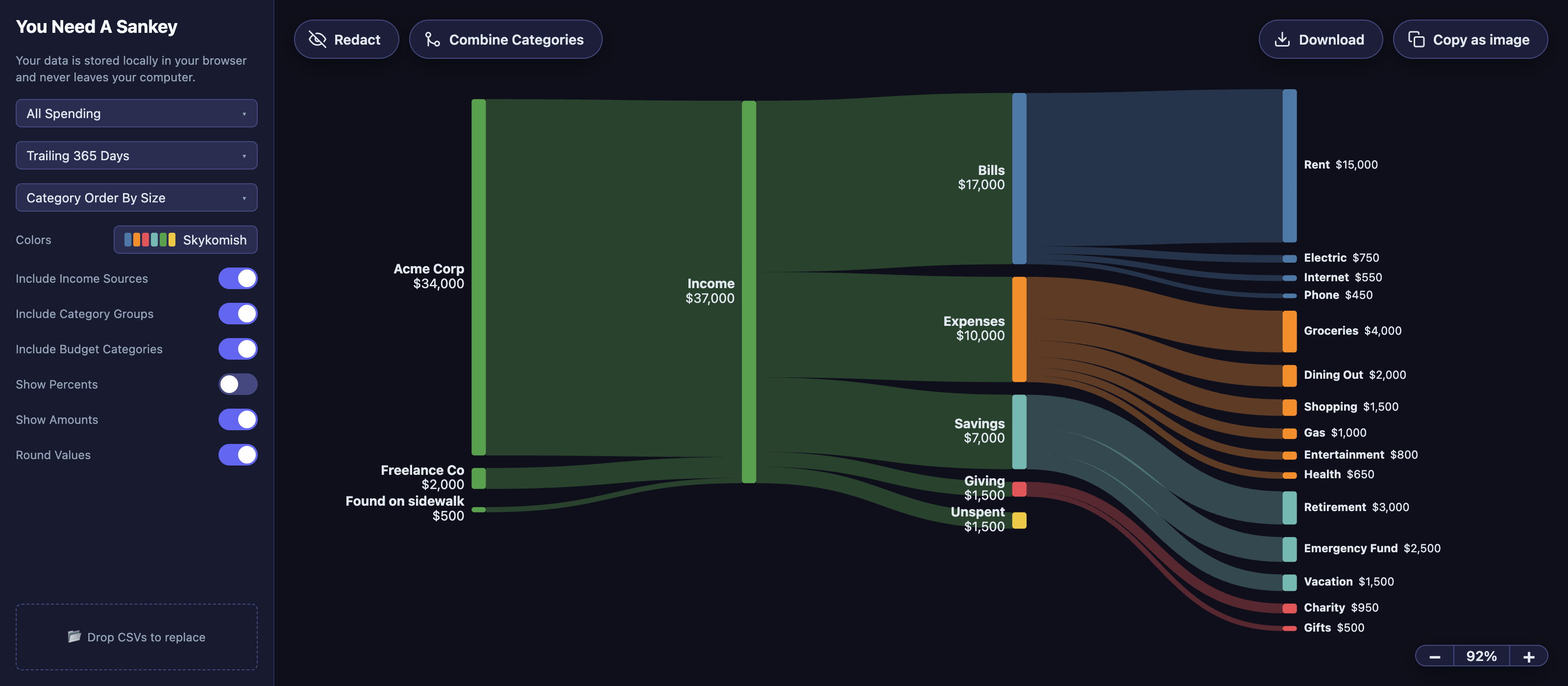
A Sankey diagram is what we need. It lets your brain easily compare values across category groups while intuitively understanding category boundaries.
My Existing Solution
I’ve created a diagram every January for the last few years with SankeyMATIC
That method was tedious though:
- I had to build a spreadsheet to transform the data to fit the syntax of the generator
- The data needs to be cleaned up, and merging category values in the spreadsheet was error prone
And hey, it’s 2026 and I have Claude Code now, so why not make some software to solve my idiosyncratic problem.
Principles for a Better Solution
-
The YNAB data is already the source of truth
The names, organization, and order of the budget categories were already thoughtfully decided. Preserve them while optimizing for scannability.
-
Let the user clean up their data without risking borking it
I can do this with display-only edits and consolidation of nodes
-
Both beautiful in a screenshot, and meaningfully interactive
This app needs to be an interactive infographic for exploring our spending patterns, but it’s also responsible for a single deliverable: A nice screenshot for my financial records (and social media, if I were so inclined, which I’m not).
-
Keep all the data local
What I built
When you ask the YNAB app for your data, it exports — a Register of every transaction and a Plan of the budget’s categories.
That data is sufficient to produce a diagram that reads left to right: inflow sources → income → category groups → individual categories
The app features various controls for customizing what information to display and how to display it.
Tricky Bits
Total inflow may be larger or smaller than total outflow.
Nobody spends the exact amount they make in a given period. To capture this reality in an intuitive way in the visualization, I created an “unspent outflow” and a “from savings ” inflow.
To help reinforce what’s going on when money from outside the budget is covering the shortfall, regardless of color palette, green-ish and red-ish colors are used for certain nodes.
Navigating a canvas with a dynamically sized diagram covered in text labels is tricky
- Thoughtfully round the node values by default
- Amounts round by magnitude (to the nearest $50, $500, or $1,000, depending on size) so labels stay scannable, while ribbon widths are drawn from the exact figures.
- De-colliding labels on low-value nodes
- Counter-scaling the labels on zoom to increase legibility on dense diagrams
- Tweaking touch targets for the smallest nodes
Renaming, Redacting, and Combining Categories
I knew I wanted 3 actions you could take on a node: rename, redact, and combine.
Since I had a well-drawn, well-spaced diagram with legible labels, I decided to go full WYSIWYG with the editing tools.
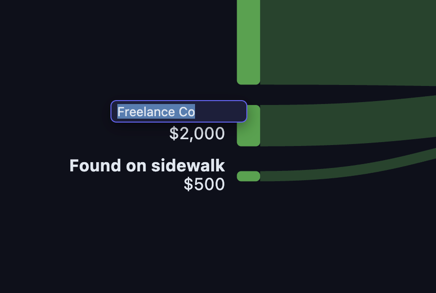
First, sticking with convention, clicking a node’s name should let you rename it.
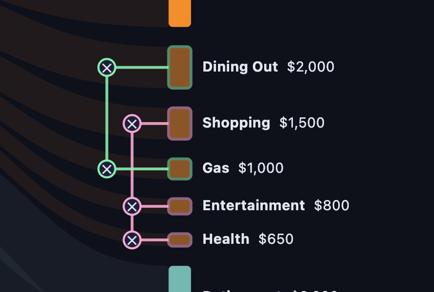
Next, combining nodes is simple conceptually, but challenging to document in a legible way. Having a discrete mode for combining categories gave me the space to draw connections atop the canvas to make understanding and editing the current category mapping simple.
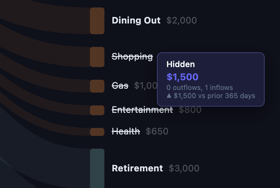
Finally, for redaction, I landed on using another similar mode, in order limit novelty in the set of interactions required of the user.
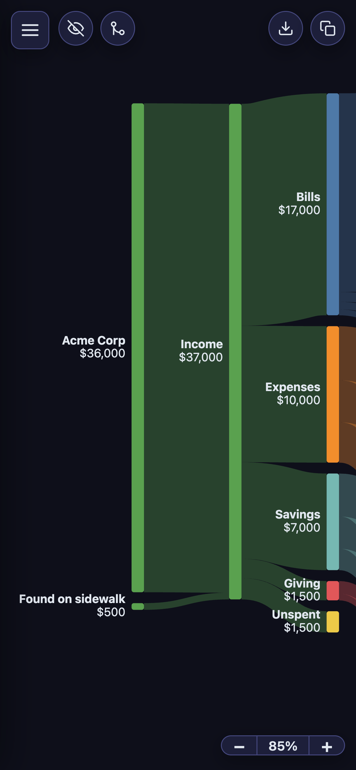
Working well on a mobile viewport was not a requirement for this project, since I knew I’d be using this tool exactly once a year on my laptop. But it was a fun challenge to get it usable on mobile. I even experimented with a minimap à la The Legend of Zelda or your favorite code editor.
Results
Turns out when you write the brief, design the solution, implement the code, test with the end user (you) and iterate until the stakeholder (you) is happy, the end result is exactly what you needed. 10/10.
If I were to do further development on this project, it would be to get a complete picture of household cashflow by incorporating gross income and payroll deductions (which are necessarily outside of YNAB budget data).